Is it Time to Refresh Your Logo?
Why are Logos so Important?
Logos are more than just a graphic icon; they represent who you are, what you do and what you offer. They are your visual identity. Over time, many companies have kept the same logo for years in honor of the company’s tradition – but is that helpful or hurtful? In some ways, keeping a logo unchanged strengthens the bond between the company, investors and consumers. But, here’s the issue, refraining from changing a logo has the potential to hinder your company’s growth in terms of investors, customers and even potential customers. As time goes on, your company needs to explore methods to maintain and strengthen relationships with your current market as well as appeal to the next generation: the millennials.
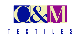
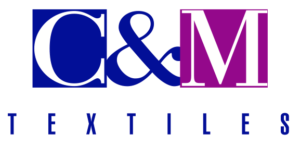
How Much Change is Too Much?
Brand recognition is important, it should be kept in mind that completely redesigning your logo is not the proper way to go, unless your current logo has had insignificant success. The goal is to continue building the trust and recognition your brand had built over the years. Modernizing your logo to fit your current and potential customer needs should be small, subtle changes such as minor changes in color and font. For more drastic changes, those should be completed gradually over a longer period of time to avoid shocking or turning away customers and investors.
Logo Trends for 2018!
As the new year approaches, new trends arise – the same applies to every creative field including fashion and decor. Colors and styles are always changing. As for trends, minimalism is the way to go, like they always say, “less is more!” Overwhelming logos will appear to be outdated, thus, customers will assume what the company is offering is outdated as well. Fluidity, geometric shapes, and juxtaposition are the most common trends for logo layout design. As for colors, the more intense, the better. Strong contrast in logos is becoming more and more popular. To be more precise, trending color combinations are contrasting blue and orange for an intriguing combination, pale green and berry purples or pale blues symbolizing health, bright yellow and lime green for a playful appeal, deep violets and dark dusty rose tones for cultural aspects, bright yellow and deep reds for a dramatic effect, a mix of intense colors paired with black and gold symbolizing power and sophistication, and finally individual colors such as bright turquoise, pink, purple, bright white and very subtle browns for technology.
Use these refreshing tips to keep your brand up to date with the current trends!
Why Choose Carte Blanche Media to Refresh Your Logo?
Here are a few examples of companies who have worked with Carte Blanche Media and have been very satisfied with their new branding!

